Insigne
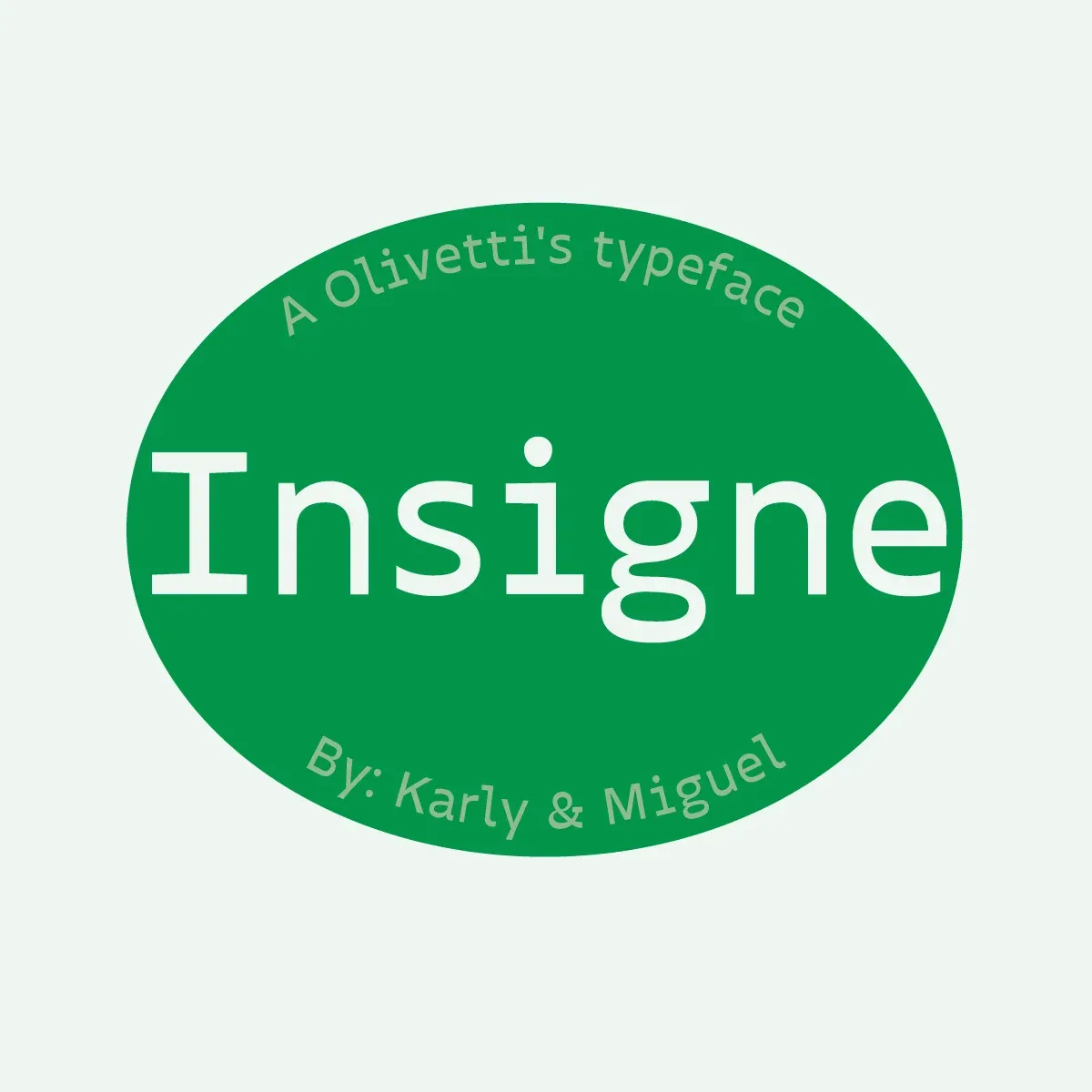
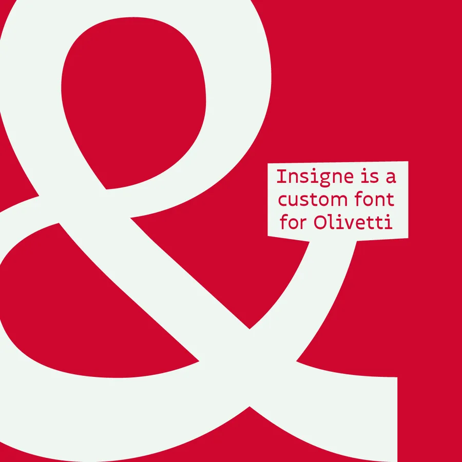
Insigne won first classification ex aequo in the fourth edition of the Olivetti Design Contest, designed by Karla Mateos and Miguel Contreras (BUAP, Puebla, Mexico).
The Olivetti Style Reimagined
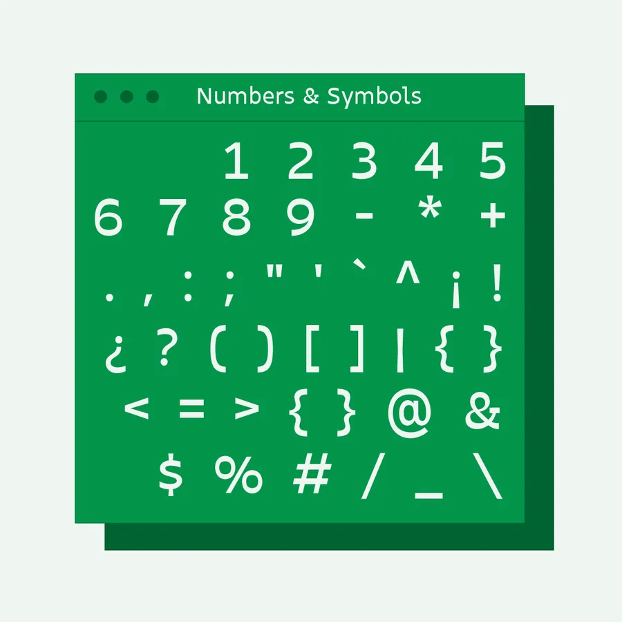
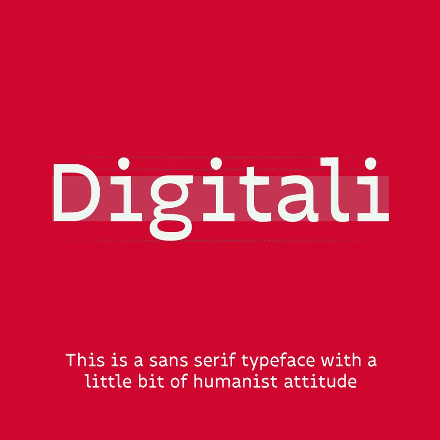
Insigne is a sans serif font that represents our vision for the Olivetti Style. It is an efficient sans serif designed for body text and optimized for screens. It draws inspiration from humanist types and combines their organic warmth with the power, simplicity, and structural clarity at the core of Olivetti’s iconic graphic and industrial heritage.
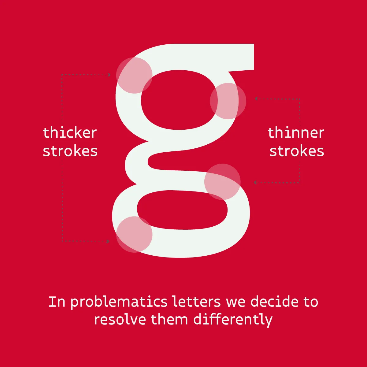 Estudio de grosor de trazos horizontales y verticales en letras complejas.
Reverse Contrast & Horizontal Rhythm
The font features a subtle inverted contrast, creating a distinctive horizontal rhythm that guides the eye smoothly across continuous lines of reading on digital screens.
This subtle shift in stroke weighting introduces a modern, innovative personality that matches Olivetti’s forward-thinking approach to communication technology.
 Composición tipográfica sobre textura mineral de malaquita verde.
Digital Optimization & Precision
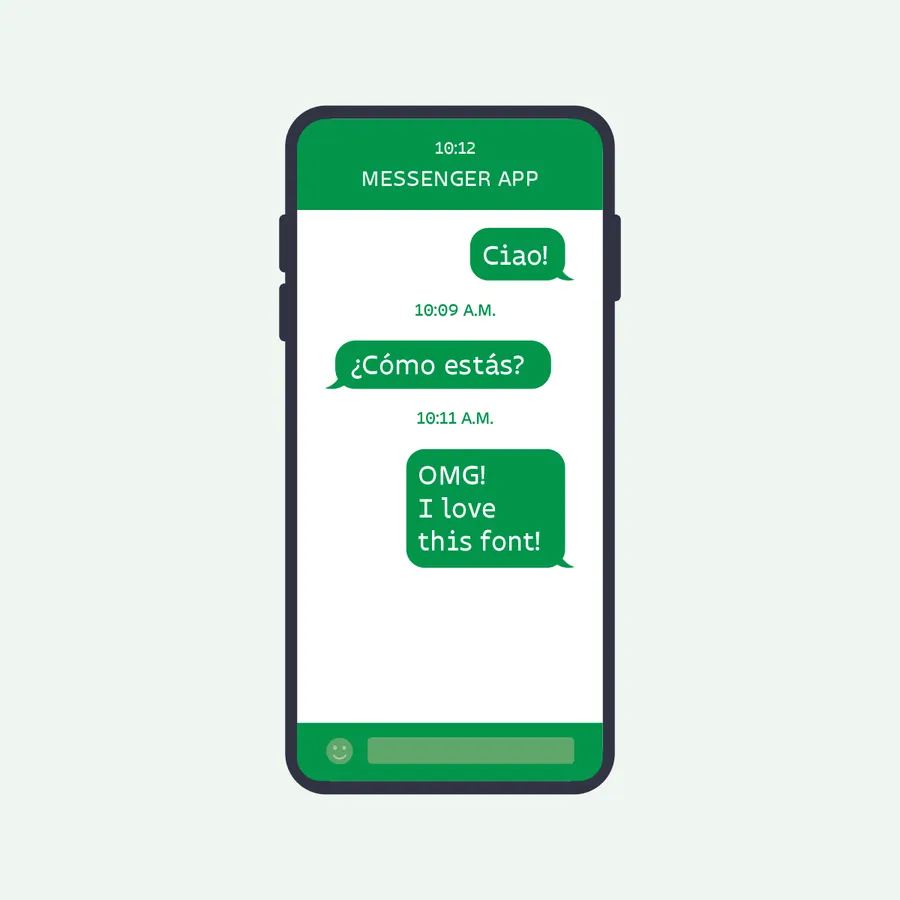
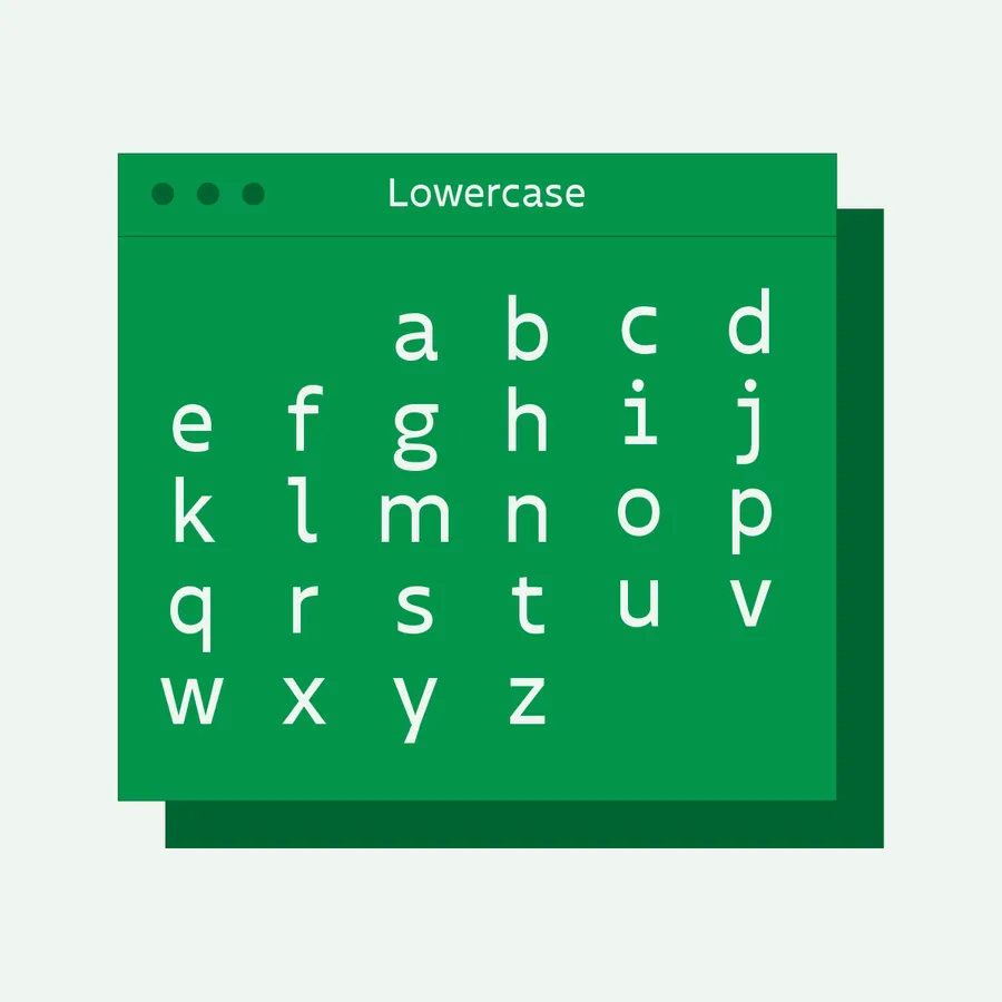
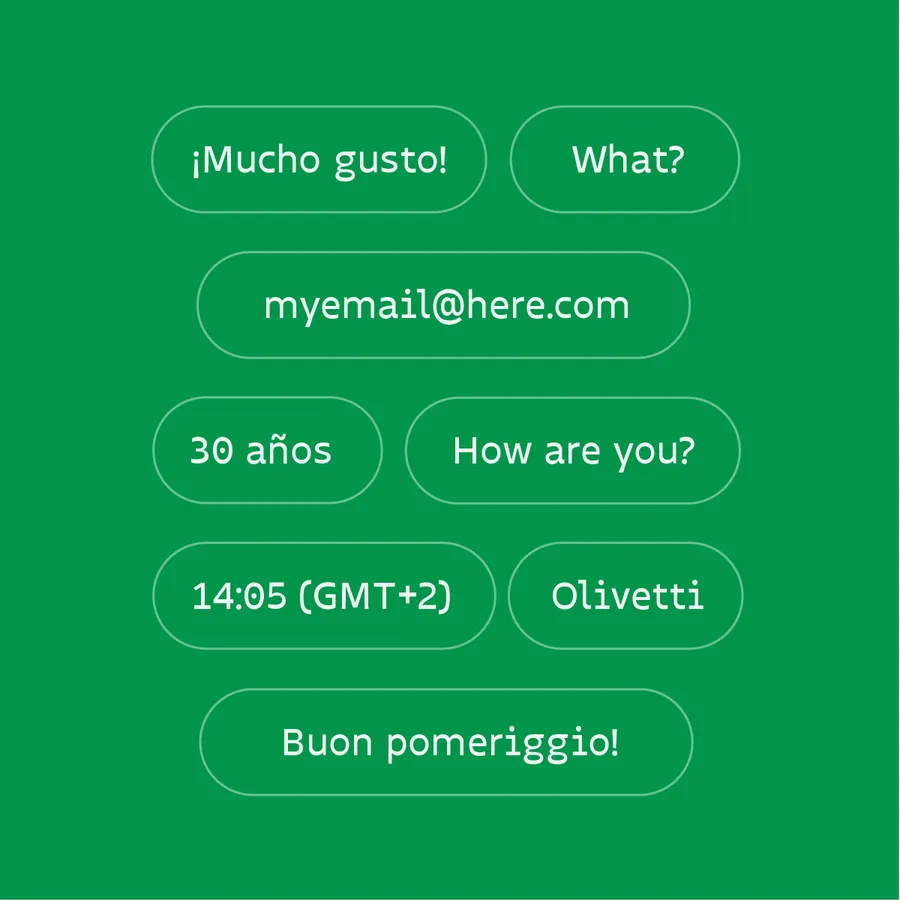
Insigne was engineered to perform seamlessly across scales, from responsive UI button pills and digital dashboards to expressive brand identity systems.
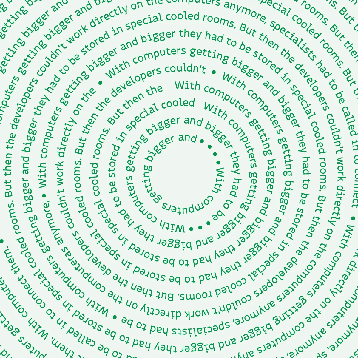 Espécimen de texto circular demostrando la estabilidad y consistencia de espaciado en curva.
Functional Geometry & Legibility
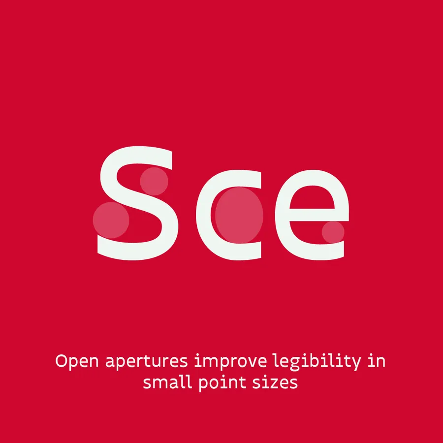
Open apertures and generous inner spaces prevent letters from clogging at small optical point sizes, retaining sharpness across diverse screen technologies.

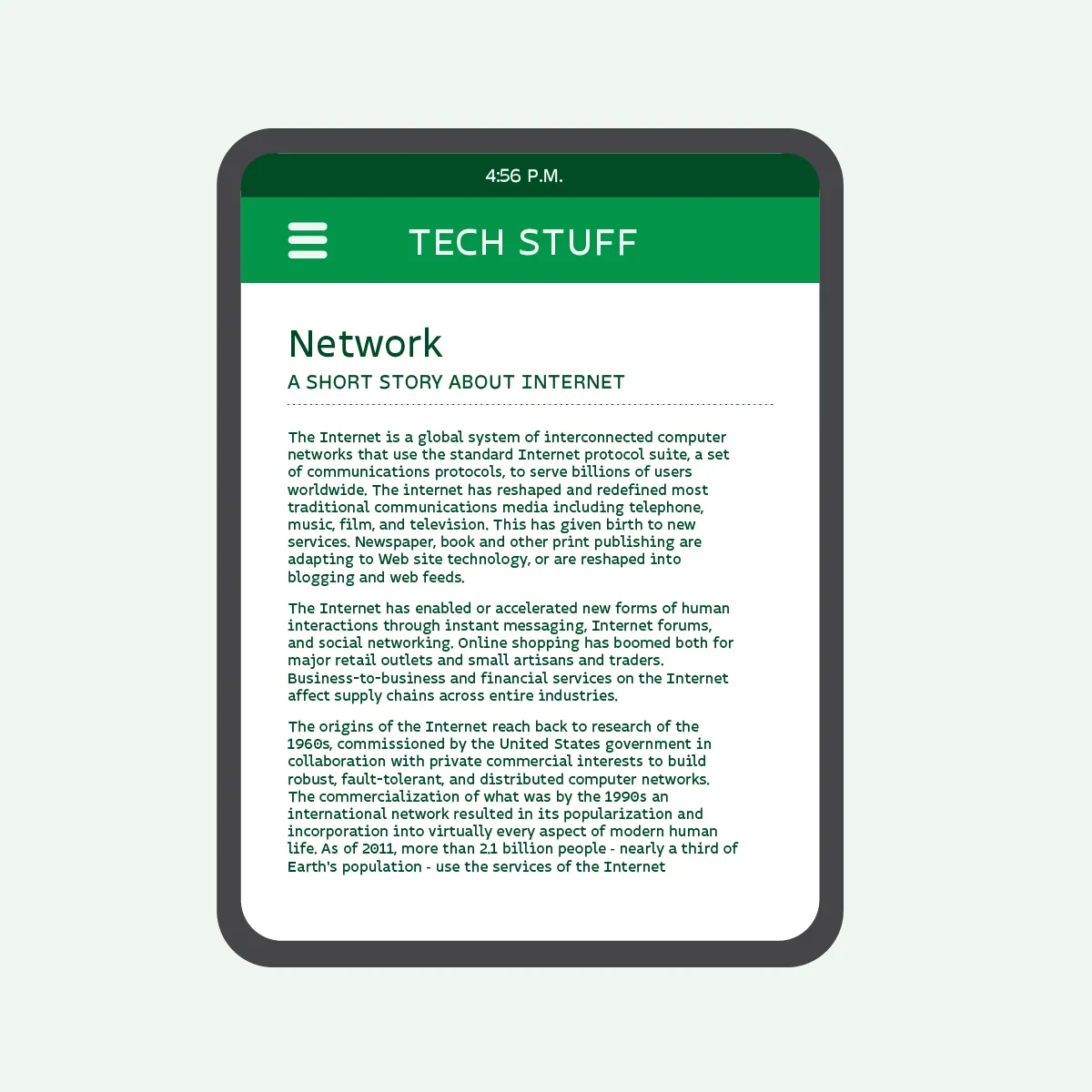 Mockup de lector digital mostrando un artículo extenso con Insigne en texto corrido.
Continuous Screen Reading
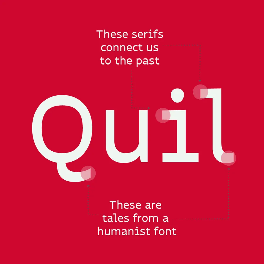
Rooted in the lineage of typewriters and humanist print history, delicate details in terminal strokes connect classic type design with contemporary user interfaces.